Logo
The Outdoor logo is one of our most valuable corporate assets. It uniquely distinguishes us from our competitors and other companies. It's the tangible symbol of our brand, representing everything we are: our expertise, our values, our people, our products.
Download all logos
Usage
Consider these important points when using the logo across a wide range of applications. Careful use and consideration are a requirement to maintain the integrity of the logo in any type of environment or experience. The logo shouldn't be altered in any way and should always adhere to this usage guidance.Clearspace
The Outdoor logo should always be clearly visible. Keep the logo separated from other visual elements by a distance equal to the cap height of the O or the circle (whichever is larger). This distance is considered the minimum uninterrupted space surrounding the logo. We call it the area of isolation, or clear space, and it should be adhered to in most situations.Logo
Wordmark
Logo Lockup (horizontal)
Logo Lockup (vertical)
Scale
Our logo has multiple forms to ensure scalability. The smallest size for the logo lockup and wordmark is 64px or 16.9mm.
The logo by itself can be sized all the way down to 16px or 4.2mm
Pro tip: While these sizes are a good place to start, use common sense, and make sure the logo is clearly visible within its use context. Always ensure readability.
Usage on photography
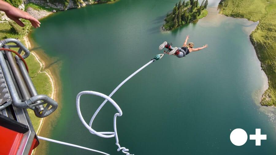
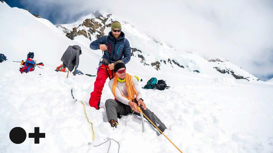
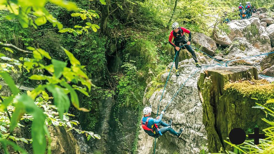
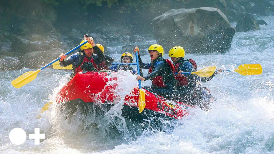
The logo should be carefully placed on photography. Always place the logo on clear and simple backgrounds with plenty of contrast for legibility. Avoid placing the logo on busy or complex backgrounds or images to keep it as legible as possible. If the background is complex, use a block color behind the logo.
Always place the logo on clear and simple backgrounds.

Always place the logo on backgrounds with plenty of contrast for legibility.

Never place the logo on busy or complex backgrounds.

Never place the logo on images that don’t provide enough contrast.
If the art direction means the logo must be placed over a complicated background, use the Outdoor color palette to create a block background.

Things to avoid
The Outdoor logo should not be placed into container shapes unless part of the art direction within a campaign. It should not be altered or embellished in any way. It should only be used in the appropriate colors from the Outdoor color palette. The following examples reflect only a handful of samples of what not to do and apply to the logo, wordmark and lockup.Don’t stretch or compress the logo.
Don’t contain the logo in a shape.
Don't change the orientation of the logo
Don't overlap the logo.
Don’t add your own taglines or mottos.
Don’t outline the logo.
Don't create patterns within the logo.
Don't use separate colors.
Don’t use drop shadows.
Don’t alter the spacing.