Brand Architecture (sub-brands)
This section needs more clarity...
Coming soonFrom sub-brands to internal teams and locations, we develop consistency and build trust through following a simple brand architecture.
Visual hierarchy
Always aim for a clear distinction between primary brand and secondary brand messaging.
OUTDOOR Primary
Futura Round Bold / Bold
OUTDOOR Secondary
Futura Round Bold / Regular
Sub-brands
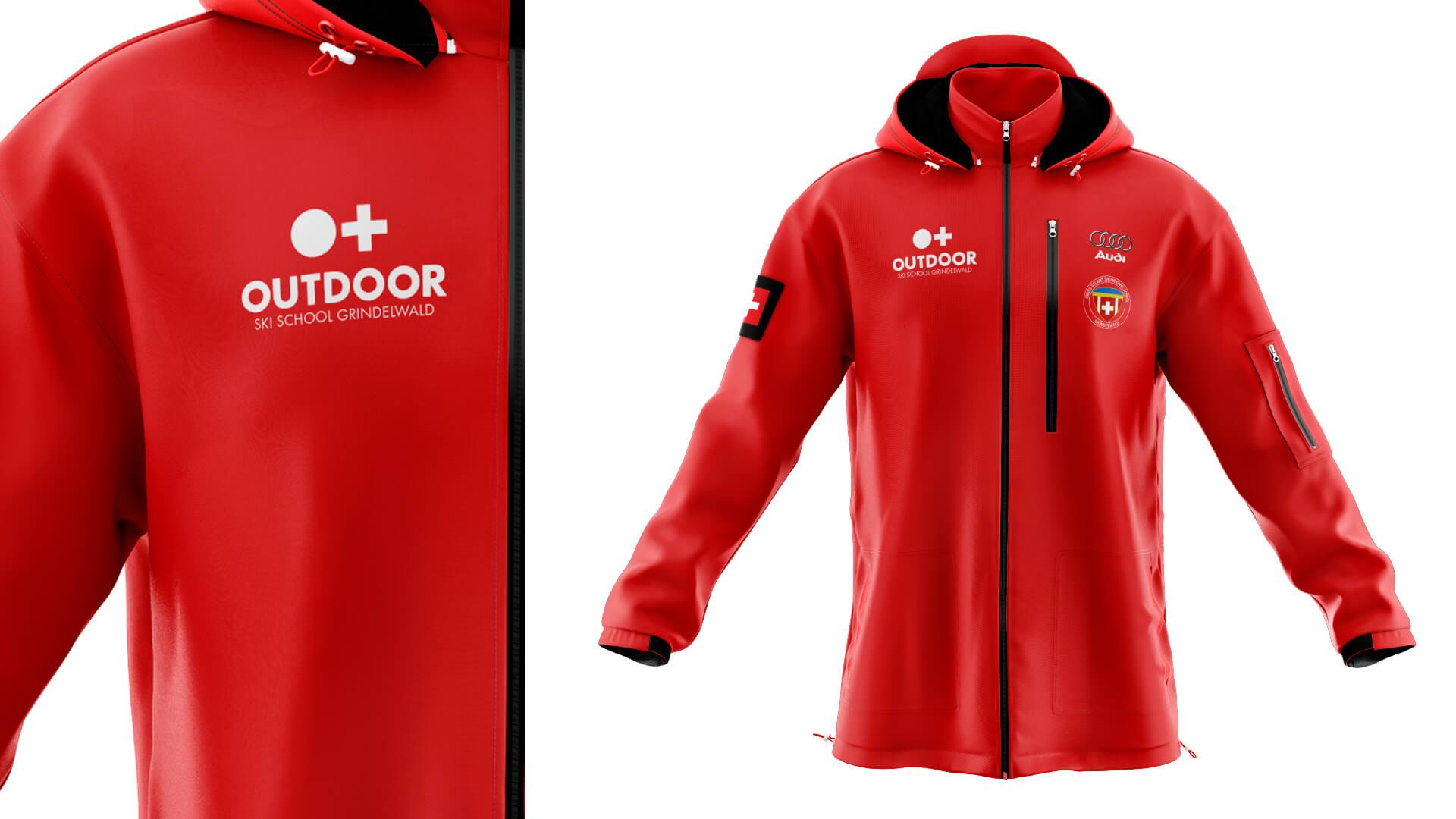
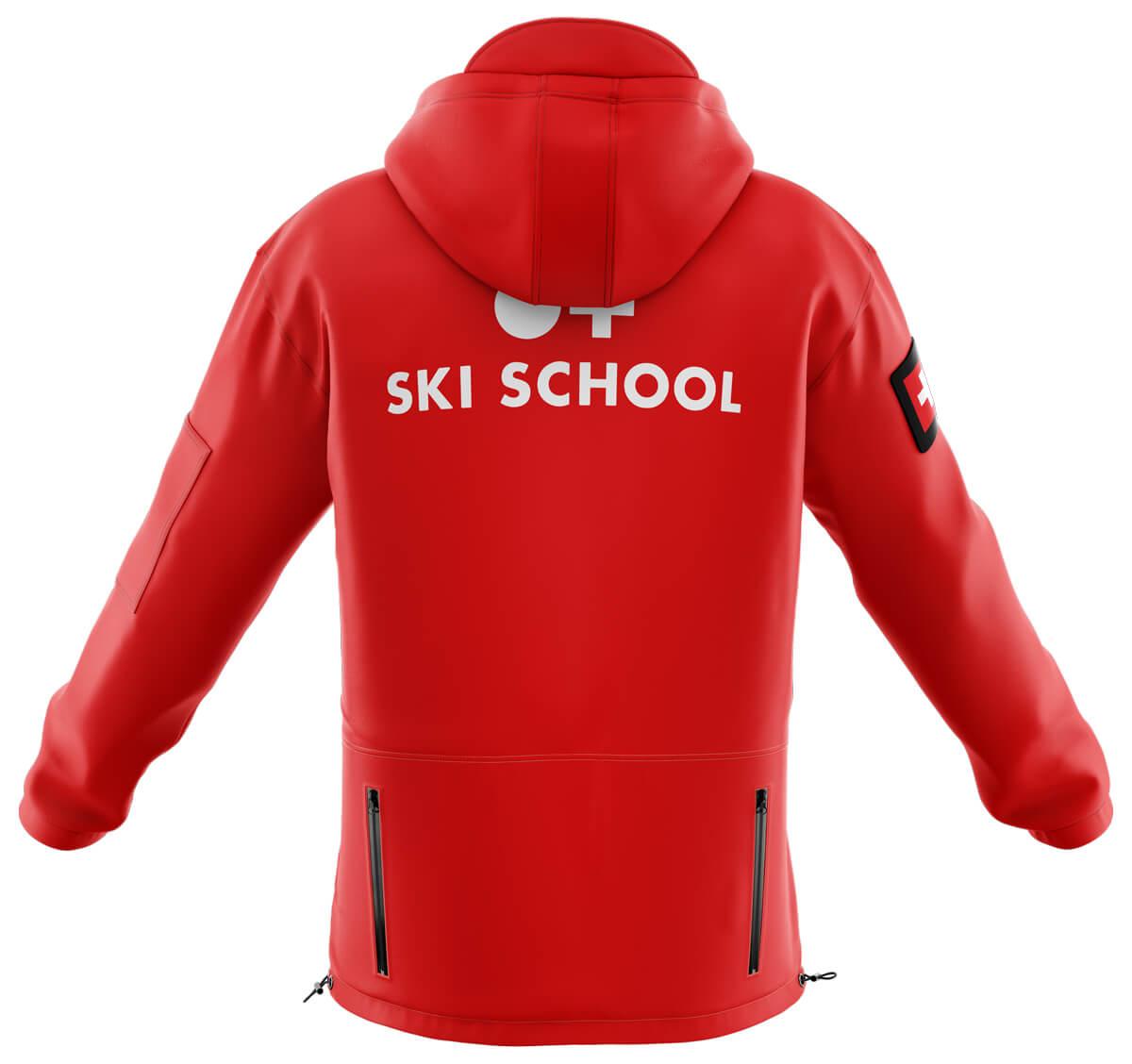
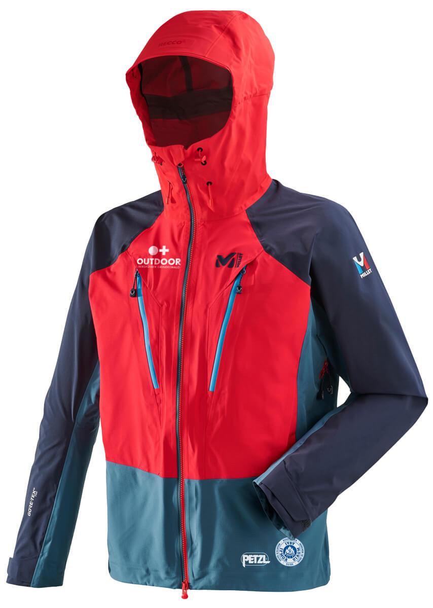
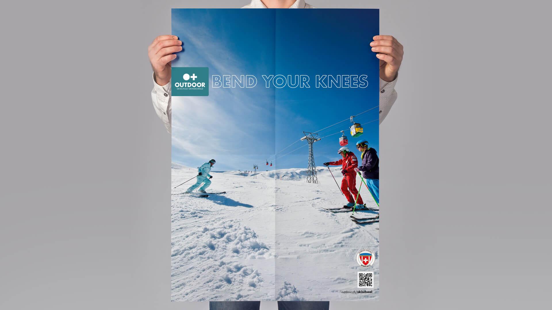
An Outdoor sub-brand is any product, service or offering that benefits from the master brand equity while communicating its own unique proposition. Ski School is a good example of a sub-brand. We plant a red badge on our logo variations to represent a sub-brand and use type contrast for bilines and secondary messaging.
Short-term campaigns and general communications are not considered as sub-brands and should not use a sub-brand logo configuration.
Secondary messaging
When adding a biline or secondary messaging, for example a location it should be:- Centered below the wordmark
- Use Futura Round Regular with kerning of 50/1000em, then manually kerned to suit.
- Scaled height is equal to one-third of the cap-height of the O in OUTDOOR.
- Distance below the wordmark is equal to one-sixth of the cap-height of the O in OUTDOOR.


